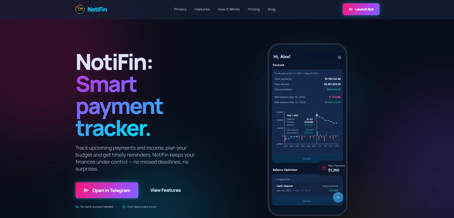
Landing page for a fintech product with a non-standard pitch. A page that sells the idea before the user even opens the app.
The service was working, users were there, reviews were good. But to share it with someone new, you had to send a link and explain: what is this, why does it exist, why should they trust it.
Telegram is great for people already inside the ecosystem. For everyone else, you need a proper entry point — one that explains why this tool exists, how it works, how it differs from calendar reminders, and why it's worth switching.
A website was needed. Not a business card — a page that sells the idea before the user ever opens the app.
«I was tired of explaining what NotiFin is and why it matters. And then having to prove it's not another crypto scam. I needed a page that did all of that for me.»

A landing page for a fintech product with an unusual pitch: no bank connections, no data collection. In a world where every other startup asks for account access, that alone is the argument.
The page is built around one scenario — a person who missed a payment or is afraid to. We take them from pain to solution, explain the mechanics, address the security concern, and give a clear call to action.
Modern design, responsive layout, fast load. No filler — only what it takes to make someone click the button.
«Now when I send the link to someone new, I don't have to explain anything. The site does it for me.»
Tell us about your project — we'll respond honestly, no deck with 60 slides.
Start a conversation →